Logo Design
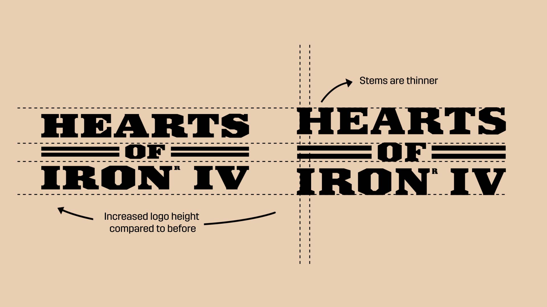
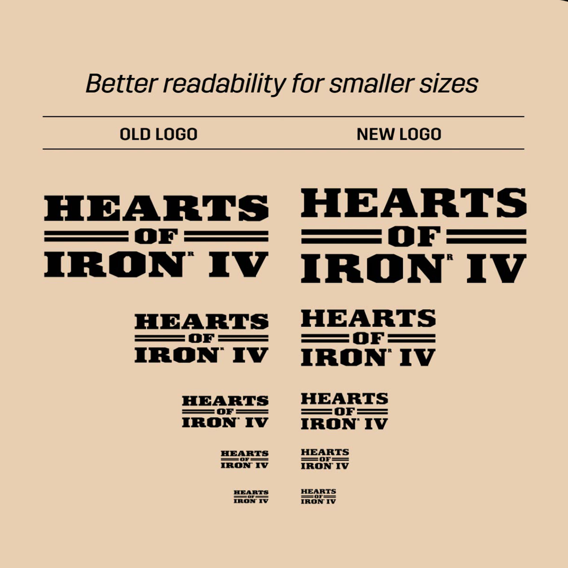
The strategic war game ‘Hearts of Iron’ wanted to update their current logo. The input was that the logo was lacking both contrast and readability. We noticed that the slab serif has a low x-height and in combination with its thick stems, that makes it almost disappear into a big blob in smaller sizes. So we took the present shapes and increased their hight, made stems slimmer and adjusted negative shapes so they wouldn’t intersect in 3D. We made the new logotype in both a final vector art and as a 3D modelled asset.